Bolton Shadow-Display Font: A Web Designer's Real Project Test
I was halfway through building a hero section for a boutique online store when I realized the headline font was falling flat. The client wanted bold, modern, and slightly dramatic—something that would stop visitors mid-scroll without overwhelming the product imagery. That is when I pulled up a font I had been testing in side projects: Bolton. This shadow-display typeface promised a built-in dimensional effect, and I was curious whether it could deliver the visual punch I needed without sacrificing readability on a live website.
First Impressions in the Hero Section
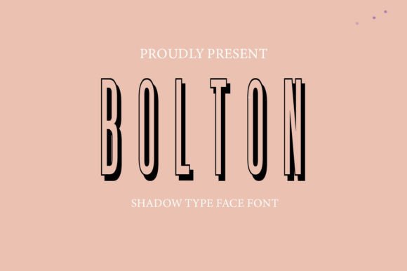
Dropping Bolton into the headline was an immediate shift. The font carries sleek, bold letterforms with a subtle shadow that creates the illusion of depth without looking gimmicky. On a dark background, the shadow effect became more pronounced, giving the store name a kind of architectural presence. I tested it over a full-width lifestyle image, and the contrast held up well—the letters remained legible even where the background had lighter patches. For a display font, that is a solid first pass.
What stood out was the balance between the shadow and the main letterform. Some shadow fonts lean too heavy on the effect, making the text feel muddy or busy. Bolton keeps the shadow clean and consistent, so the eye reads the word first and then registers the depth. That matters when you are designing for fast scanning behavior, especially on a homepage where visitors decide within seconds whether to stay or bounce.
Where Bolton Works Best in a Digital Layout
After testing across several sections, I found Bolton shines brightest in short, high-impact placements. It is not a body font, and it does not try to be. Instead, it excels in these specific roles:
- Hero headlines – The shadow effect adds a layer of polish that makes the main tagline feel more substantial and premium.
- Call-to-action buttons – When used sparingly for a single word or short phrase, Bolton creates a strong focal point that draws the click.
- Section headings – On landing pages for courses or coaching programs, the font gives each section a distinct visual identity.
- Logo text or brand accents – For a digital brand kit, Bolton can serve as a signature typeface for the logo or select decorative elements.
- Promotional banners – In campaign landing pages, the shadow effect helps the offer stand out against competing visual elements.
I also tested it on a blog header for a creative portfolio site. The bold, dimensional letterforms gave the title a modern editorial feel without needing additional graphics or overlays. That is a real time-saver when you are building a site solo and want to keep the visual complexity low.
Readability Considerations Across Devices
Any web designer knows that a font that looks stunning on a 27-inch monitor can fall apart on a phone screen. I tested Bolton at various sizes and on both light and dark backgrounds. Here is what I observed:
- Desktop hero sizes (48px and above) – The shadow effect is crisp and adds depth without blurring. The letters remain easy to read at a glance.
- Mobile viewports (around 24px–32px) – At smaller sizes, the shadow still works, but the letter spacing becomes more critical. I added a little tracking to keep the characters from feeling crowded.
- Dark backgrounds – The shadow effect is more visible, which can be a good thing, but be careful with very dark backgrounds where the shadow might blend into the background. A light-colored text with a slightly darker shadow works best.
- Light backgrounds – The shadow is subtler, which is actually ideal for preserving readability while still adding a hint of dimension.
- Image overlays – This is where Bolton really performs. The shadow helps the text stand out from busy backgrounds, reducing the need for heavy text shields or dark overlays.
One practical tip: when using Bolton on buttons, keep the label to one or two words. Longer phrases can feel cramped, and the shadow effect may compete with the button shape. For a checkout page or a course enrollment button, a short, bold action word works perfectly.
Font Pairing for a Cohesive Brand Identity
Since Bolton is a display font with a strong personality, it needs a reliable partner for body copy, navigation, and supporting text. I tested two pairings that worked well in different contexts:
Pairing with a clean sans serif – For a boutique online store, I paired Bolton with a simple geometric sans serif for product descriptions, menu items, and footer text. The contrast between the dimensional headline and the clean, flat body text created a clear hierarchy. The sans serif let Bolton do the heavy lifting visually without competing for attention.
Pairing with a modern serif – For a coaching website or a course sales page, I tried a refined serif font for the body copy. The combination gave the site an editorial, trustworthy feel. The serif added warmth and authority, while Bolton handled the high-impact moments. This pairing worked particularly well on longer landing pages where you want to build credibility before asking for the click.
If you are building a digital brand kit, I recommend limiting Bolton to one or two applications per page. Overusing a display font can dilute its impact and make the layout feel noisy. Let it be the accent, not the main voice.
Practical Checks Before Going Live
Before committing to Bolton in a client project, I ran through a few practical checks that every designer should consider:
- Webfont availability – I confirmed that the font is available in web formats and that the licensing covers website use. Commercial font licensing is straightforward with Bolton, but always double-check the terms for client projects and online stores.
- File formats – Having the right files (WOFF, WOFF2, and fallback options) ensures consistent rendering across browsers. I tested on Chrome, Firefox, Safari, and Edge, and the shadow effect held up well across all of them.
- Alternates and weights – Bolton includes a range of styles, which is useful for fine-tuning the typography. I experimented with different weights to see how the shadow effect scaled, and the lighter weights retained a refined look while the bolder ones felt more assertive.
- Multilingual support – If your project targets a global audience, check the character set. Bolton covers a solid range of Latin-based languages, which covers most English and European markets.
- Loading speed – Display fonts with special effects can sometimes be heavy, but Bolton loaded quickly in my tests. Always check the page speed impact, especially on mobile connections.
Real-World Applications I Tested
Beyond the boutique store, I tried Bolton in a few other digital contexts to see how it adapted:
- Portfolio homepage – For a creative professional, Bolton in the hero section gave the name a bold, memorable presence. The shadow effect added a subtle creative edge without overshadowing the work samples.
- Course sales page – A short, punchy headline like "Master the Craft" in Bolton created immediate visual interest. The section headings below it used a lighter weight of the same font, which kept the hierarchy consistent.
- Campaign landing page – For a limited-time promotion, I used Bolton for the offer headline and a sans serif for the supporting details. The shadow effect helped the offer stand out in a busy layout with multiple graphic elements.
- Digital brand kit – As a signature typeface for a brand guideline document, Bolton added a modern, distinctive feel. It worked well for the brand name and key taglines, while a secondary font handled the body text.
In each case, the font performed best when I gave it room to breathe. Generous padding, adequate line height, and careful spacing around the text made the shadow effect feel intentional rather than overwhelming.
How Bolton Affects User Engagement and Brand Trust
Typography is a silent communicator. When visitors land on a page, the font choice shapes their first impression of the brand's professionalism and personality. A shadow-display font like Bolton signals creativity, confidence, and attention to detail. It suggests that the brand is modern and willing to take design risks—but only when the execution is clean and purposeful.
In my testing, the font helped improve the visual hierarchy of the page. The bold, dimensional headlines naturally drew the eye before the supporting text, which is exactly what you want in a hero section or a call-to-action area. Visitors could scan the page quickly and understand the message without friction. That is the kind of subtle UX improvement that builds trust over time.
At the same time, a display font can undermine trust if it is used in the wrong context. For example, placing Bolton in a long paragraph of body text would likely hurt readability and make the site feel less professional. Knowing where to use it—and where to let simpler fonts take over—is key to maintaining a polished brand experience.
Final Thoughts on Bolton for Web Design Projects
I have been testing Bolton in real web design projects for a few weeks now, and it has earned a spot in my toolkit for display typography. It brings a clean, modern shadow effect that adds depth without clutter, and it holds up well across devices when used thoughtfully. Whether you are designing for a boutique online store, a coaching website, a portfolio site, or a campaign landing page, Bolton can give your headlines and accents a distinctive edge.
That said, it is not a font you want to use everywhere. Its strength is in short, high-impact placements where the shadow effect can shine. Pair it with a solid sans serif or a refined serif for body copy, and you will have a balanced, professional typography system that feels both creative and trustworthy.
If you are a web designer, UI designer, or digital product creator looking for a display font that brings something fresh to the table, Bolton is worth a test drive. Load it into your next project, try it in a hero section or a call-to-action button, and see how it changes the feel of the layout. Sometimes the right typeface is all you need to take a design from good to memorable.